
Katie’s Keys · Bath
How to Add Color to a Bathroom Without Remodeling
Turn an all-white guest bath into a calm, layered retreat in one afternoon.
At a Glance
How do you add color to a bathroom without remodeling?
To add color to a bathroom without remodeling, pick one color family and layer it through towels, bath mats, art, and a shower curtain. Mix light and dark versions of the color, repeat textures and patterns, and edit anything that pulls off-palette. Keep permanent pieces like the tub and tile neutral so the color is easy to change later.
- Pick one color family and check undertones against white.
- Mix lights and darks so the room doesn’t look flat.
- Layer texture and pattern instead of matching everything.
- Use the 60-30-10 rule to keep one piece from overpowering the room.
- Hang the shower curtain last, since it sets the balance.
Welcome back to Katie’s Keys, where I help you get your…house in order.
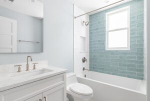
Today I’m giving a very neutral guest bathroom some personality. The bathroom itself is in great shape. The fixtures work, the layout makes sense, and everything is clean. It’s just a little…blank. White towels, white mats, white everything. It’s the kind of room that’s perfectly fine but doesn’t feel like anyone actually lives there.
If you’ve been wondering how to add color to a bathroom without taking on a whole project, this one’s for you. You don’t need to completely redo a bathroom to make it feel new. Sometimes you just need to add a little color harmony into the mix. New towels, a couple of rugs, a piece of art, and a shower curtain can change the whole personality of a room in one afternoon, and for a lot less than you’d think.
So I headed to HomeGoods with one goal: take a room full of whites and bring it to life with blue.
In This Article
- What is color harmony?
- What color schemes work in a bathroom?
- How do I find the right colors for my bathroom?
- Should everything in a bathroom match?
- Why is blue a good bathroom color?
- What colors go with blue in a bathroom?
- Shopping and styling the room
- When does a bathroom need more than a refresh?
What is color harmony?
Color harmony just means choosing colors that look like they belong together. When a room has it, your eye moves around the space easily and everything feels connected. When it doesn’t, you get pieces that each look fine on their own but don’t quite work together.
The easiest way to create harmony is to pick one color and use lots of different versions of it. Here’s how those versions work, using blue:
- Hue is the color itself. In this bathroom, it’s blue.
- Value is how light or dark a color is. Sky blue and navy are the same hue with very different values.
- Tint is a color with white mixed in. Tints are the soft, airy versions, like baby blue or powder blue.
- Shade is a color with black mixed in. Shades are the deep versions, like navy or midnight.
- Tone is a color with gray mixed in. Tones are the muted, dusty versions, like slate blue or soft denim.
- Saturation is how bright or muted a color is. A bright cobalt towel is highly saturated. A grayish-blue rug is much less saturated.
Once you know these, shopping gets a lot easier. Instead of asking “Is this the right blue?” you can ask “Do I have enough light blues? Do I need something deeper? Is everything too bright?”
What color schemes work in a bathroom?
Designers use a few classic bathroom color schemes to put colors together. You don’t have to memorize them, but knowing them helps you understand why some rooms feel calm and others feel bold.
Monochromatic. A monochromatic scheme is built from tints and shades of the same color. This is the simplest and most forgiving approach, and it’s a great place to start if color makes you nervous.
Analogous. An analogous scheme uses three colors that sit next to each other on the color wheel. Blue, blue-green, and green are a classic example. Because they’re neighbors, they blend naturally and give you a little more variety than a single color.
Complementary. A complementary scheme uses colors that sit directly opposite each other on the color wheel. Blue’s complement is orange. Red’s is green, and yellow’s is purple. These pairs create a lot of contrast, which makes a room feel bolder and more dramatic. When you place complements side by side, each one makes the other look more intense.
That intensity can be really fun, and it can also be a lot. A bright cobalt towel next to a bright orange rug practically vibrates, and in a small bathroom full of tile and mirrors that bounce color around, it can feel jarring fast. If you want to use a complementary scheme, mute it. A dusty slate blue next to a soft terracotta or warm peach gives you the same contrast in a gentler way. Lowering the saturation takes the edge off, so the colors play off each other instead of fighting.
You can also use a complement as a small accent instead of a main color. Brass hardware, a wood tray, or a few coral flowers in a vase all bring a touch of warmth to a blue room without taking over.
For this bathroom, I kept it simple and stayed in the blue family. It’s a guest bath, and I wanted it to feel calm and welcoming, not high-energy. Sticking with blues let me play with light and dark, texture, and pattern without worrying about the colors competing.
How do I find the right colors for my bathroom?
There’s no single right color for a bathroom. The colors you love say something about you: where you feel happiest, what you grew up around, and what helps you relax. Someone who loves the beach might gravitate toward sandy neutrals and sea glass blues. Someone who spends every weekend in the garden might love soft greens and earthy terracotta. Someone else might want a little drama with a deep navy or moody charcoal. None of those is wrong. They’re just different people.
If you’re not sure what your colors are, start by looking around. Check your closet and notice which colors you reach for most. Scroll through the photos you’ve saved, the places you’ve traveled, or the rooms you’ve stopped to admire in someone else’s home. You’ll usually spot a pattern. You probably have a few colors you keep coming back to without realizing it.
Then try them out in small ways. That’s what I love about a refresh like this. You don’t have to commit to painted walls or new tile to find out whether you love a color. A set of towels, a bath mat, a shower curtain, or a vase of flowers lets you live with a color for a few weeks and see how it feels. If it makes you smile every time you walk in, you’ve found something. If it starts to feel off, swap it out. It’s low-risk and easy to change.
The bathroom is a great place to experiment because it’s small, and a few pieces make a big difference. What you learn there can carry into the rest of your home, and it helps a lot if you ever take on a bigger project down the road, like a new shower. Knowing which colors feel like you makes every decision after that easier.
Should everything in a bathroom match?
I’m not trying to make everything match. If every towel, rug, and accessory is the exact same blue, the room looks like it came out of one box. It can end up feeling a little flat and a little catalog.
I want pieces that relate to each other:
- A lighter blue here and a darker one there.
- A linear texture on the towels that echoes the rugs.
- A patterned shower curtain next to solid mats.
When the colors, patterns, and textures connect without being identical, the room feels like someone chose each piece on purpose. It looks collected instead of bought as a set.
Why is blue a good bathroom color?
My mom stays in the guest room a lot, so she’s who I had in mind the whole time. When she visits, I want this bathroom to feel like a little retreat. It’s the first place she gets ready in the morning and the last place she winds down at night, in a house that isn’t her own. I wanted it to feel calm, easy, and welcoming.
That’s a big part of why I went with blue. Softer blues give me that sense of calm, and that’s exactly the feeling I want for her. A guest bath should feel restful, like somewhere you can take a breath after a long drive or before a busy day with family.
Blue is also easy for me to live with. It feels fresh and clean, which matters in a bathroom, but it’s much softer and friendlier than all that white. The all-white version of this room was clean, but it felt a little like a hotel before check-in. Blue makes it feel like someone was expecting her.
I’ll admit blue is technically a cool color, so it’s fair to ask how it can feel warm. The warmth comes from everything around it: plush towels, a soft mat by the shower, fresh flowers in the vase, and a mix of lighter and deeper blues so the room feels layered instead of icy. Pairing blue with warm metallics like gold or brass also helps balance out its coolness. Calm color plus cozy details is what makes a room feel both relaxing and inviting.
And I just love blue. To me, it’s a color and a neutral at the same time. It has so much more personality than white, but it goes with almost everything, including white tile, chrome fixtures, and wood tones.
Blue gives you a lot of range, too. Pale shades can keep a room feeling light and open, while deeper shades like navy bring more depth. In a guest bath, I like having both: light blues to keep it fresh, and a few deeper blues so it doesn’t feel washed out.
What colors go with blue in a bathroom?
If you love blue but want a little more going on, here are the colors I think pair best with it in a bathroom:
- Crisp white. The easiest partner there is. White fixtures and trim make every shade of blue look fresh.
- Warm wood. A wood tray, stool, or shelf warms up cool blues instantly.
- Brass or gold. Hardware, a mirror frame, or a soap dish adds a little glow.
- Sandy neutrals. Soft beige and oatmeal give you a relaxed, coastal feel.
- Soft coral or peach. A muted version of blue’s complement, perfect for flowers or a small accent.
- Soft gray. Keeps things calm and a little more modern.
Pick one or two, not all six. Blue should stay the star.
Check your undertones
Not all blues are the same kind of blue. Some lean a little green, like teal or aqua. Others lean a little purple, like periwinkle or cornflower. That hidden lean is called the undertone, and it matters more than you’d think.
Blues with the same undertone are an easy starting point. Mixing a green-leaning blue with a purple-leaning blue can make one of them look “off,” even if you can’t say why. The easiest way to check is to hold two pieces side by side against something pure white, like a white towel or your sink. The undertones show up much more clearly against white.
Your fixtures have undertones, too. A bright white tub, a creamy almond sink, and a cool gray tile floor will each pull your blues in a different direction. Look at what’s already in the room before you shop.
I shop broad, then edit
When I shop, I go really broad first and edit down from there. Anything that catches my eye and could work goes into the cart: towels, rugs, art, vases, trays, all of it. I don’t make any decisions until I can see the direction taking shape.
This takes the pressure off. It’s hard to know whether a towel is right when it’s sitting alone on a shelf. Next to a rug, a print, and a shower curtain, it’s easy. The palette shows itself once everything is together, and suddenly it’s obvious what belongs and what doesn’t.
My tip: use your cart like a mood board. Keep rearranging things as you shop and look at them side by side. You’ll start to notice which pieces keep looking good together and which ones stick out.
Mix your lights and darks
This is where the room gets its depth. A range of values, from pale tints to deep shades, keeps a one-color room from looking flat. When everything is the same medium blue, the room loses its shape.
A simple way to check: squint at your cart. If everything blurs into one medium blue, you need more contrast. Add something noticeably lighter, like a pale towel, or something noticeably darker, like a navy print. You want to see the difference between pieces even from across the room.
Then think about texture and pattern
Once I had my blues going, I went looking for towels, because texture and pattern are the other half of color harmony.
I found two towels I liked. One had little circular textures, and the other had a linear pattern. Both were pretty, but I went with the lines because they synced up better with the rugs I was planning to get. That’s the kind of decision that makes a room feel intentional. Nobody will consciously notice that the towel stripes echo the rug, but they’ll feel that everything goes together.
When your colors are this close, texture and pattern do a lot of the work. A ribbed towel, a plush rug, a smooth ceramic vase, and a printed curtain can all be blue and still feel completely different. Here’s how I think about it:
- Repeat a pattern or texture across two or three pieces to tie them together.
- Mix solids with prints so your eye has somewhere to rest.
- Vary the scale. One big bold print, like a shower curtain, works best alongside smaller or quieter patterns.
Let your art get creative
I found a print that could go above the toilet. It has different shades of blue, but it also has a lot of other colors. That’s okay. Art is where you can get a little more creative.
A piece of art doesn’t have to follow your palette perfectly. As long as it shares one or two colors with the rest of the room, it can look intentional. That little bit of freedom actually helps. It keeps a coordinated room from feeling like a matching set, and it gives the space some personality that towels alone can’t.
If you’re unsure, hold the art next to your towels and rug. If the blues in the print pick up the blues in your textiles, you’re good.
Be willing to say goodbye
Starting broad only works if you’re willing to edit. This is the hardest part, because you’ll have to let go of things you really like.
I found a cute tray, but I decided to part ways with it because there was just a lot going on. It didn’t sync up with the rest of the room. Liking something isn’t enough. The question is always: does this help the room I’m creating?
I also passed on a few pieces that were pulling the palette toward green, which wasn’t the direction I’d chosen. That drift is easy to miss because blue and green sit right next to each other on the color wheel. One teal piece can look fine, but three or four start changing the whole mood. Once you pick a direction, stick with it.
Back at home: towels first
Once I got home, it was time to put everything in its place. I always start with the towels. They’re quick to swap, and they’re some of the biggest pops of color in the room, so they set the direction for everything else.
The old towels went straight into the wash. I left the tags on the new ones, though. A room can look totally different at home than it did in the store, mostly because of the lighting. Store lights might be bright and cool. Your bathroom might have warm bulbs, a small window, or no window at all, and all of that changes how blue looks. So I don’t commit until everything is up, I’ve seen it in daylight and at night, and I’m sure I love it. Keep your receipts and check the return policy, too.
For the bath towel, I folded it so it hangs straight all the way down. It’s such a small thing, but a neat, even towel instantly makes a bathroom feel a little more like a hotel. Then I double-folded the matching hand towel so it looks tidy and finished on the bar.
That’s when the change really started to show. Goodbye, white-on-white. Time for color.
Next, the floor. The towel set came with two bath mats for just $19.99, which was a great way to carry the color from eye level down to the floor. I put the bigger mat down first to anchor the room, then placed the smaller one right by the shower, where you step out. Now the blue shows up at every level of the room, not just on the towel bar, and that’s what starts to make it feel like one cohesive space.
Shop your own home
Next came the vase I was so excited about. I swapped it in over the toilet, and I’ll fill it with flowers later. Fresh flowers are one of the easiest ways to make a guest bath feel thoughtful, and they’re a great place to add a little warm accent if you want one.
Then I noticed something I’d completely overlooked. A container I’d owned forever was blue, and I’d never even realized it. I moved my beauty products into a different container and put the blue one on display.
This happens all the time once you commit to a color. You start seeing your own things differently. Before you buy another accessory, walk around your house and check your cabinets, closets, and other rooms. A tray, a jar, or a small dish you already own might be exactly what the room needs, and it costs nothing.
Save the biggest piece for last
At the store, I wasn’t sure about the shower curtain. I thought it could work with the mix, but it might be a lot with the print I’d already picked. So I bought it and decided to see it at home before making a final call.
Once it went up, it felt like a main event. That’s why I hang it last. The shower curtain is the biggest piece of fabric in the room, so it sets the balance for everything else. If it’s too busy or too bold, it will take over. If it’s right, it pulls the whole palette together.
There’s a classic rule of thumb that helps here. The 60-30-10 rule puts your main color on about 60% of the room, a supporting color on about 30%, and an accent color on the last 10%, usually through things like decorative objects, lamps, or artwork. In a bathroom like this, the white tile and walls might be your 60, the blue textiles and shower curtain your 30, and the art, vase, and small accessories your 10. It isn’t strict, but it’s a helpful way to check whether one piece is overpowering the space.
When does a bathroom need more than a refresh?
A refresh like this can do a lot, but it can’t fix everything. Towels and a shower curtain won’t hide a chipped tub, a shower that’s past its prime, or a layout that just doesn’t work for the people using it.
Here’s how I think about it. If the bones of your bathroom are in good shape and it just feels blank, decor is your answer. But if you find yourself decorating around something, it might be time to look at a bathroom remodel:
- A worn or dated tub. If your tub is stained, chipped, or a color you’d never pick today, replacing the tub resets the whole room.
- A tub nobody uses. If it’s really just a place to stand and shower, you could convert it to a walk-in shower and make the space better suited to your routine.
- A shower that’s showing its age. Cracked surrounds, grout that won’t come clean, or old doors are all reasons to consider a new shower.
- Changing needs. I think about this with my mom, too. As the people you love get older, a bathroom that’s easier to step into, with features such as grab bars and a low-threshold shower, can make visits more comfortable.
And here’s where color harmony comes back in. When you’re choosing the permanent pieces, like a tub, shower walls, or flooring, keep them simple and timeless. Those are your 60. Then let the towels, rugs, and art carry the color. That way, you can change your palette whenever you want without touching the big stuff.
So this is color harmony
It’s not too much and it’s not too little, but you can definitely see the blue theme, and it absolutely brightened up the space. The room still feels calm and clean. It just finally feels like someone cared about it, and that’s exactly what I wanted for my mom.
I’m honestly so happy with how it turned out. I walked in with a blank white bathroom and a cart full of maybes, and I walked out with a room that feels warm, personal, and finished, all without picking up a paintbrush or calling a contractor. Every time I walk past it now, it makes me smile, and I can’t wait for my mom’s next visit so she can see it.
I hope this gives you the confidence to try it in your own home. Whether you love blue or you’re drawn to something completely different, start small. Grab a few towels, a mat, or a piece of art in a color you love, and see how it feels. You might be surprised how much a few thoughtful changes can do. And if you give it a try, I’d love to see what you create.
To sum it up:
- Pick a color family.
- Check your undertones.
- Mix your lights and darks.
- Layer texture and pattern.
- Keep contrast in check, and mute it if you use complementary colors.
- Edit anything that doesn’t belong.
- Shop your own home.
- Hang the biggest piece last.
- Choose pieces that relate to each other, not pieces that are identical.
This article was written by Katie Long DePaola, a fourth-generation member of Long Home’s founding family and the voice behind Katie’s Keys, where she shares home improvement ideas and practical inspiration to help homeowners create spaces that work for them.
When a refresh isn’t enough and the tub, shower, or layout itself is the problem, Long Home’s bath remodeling team can help. Request a consultation.